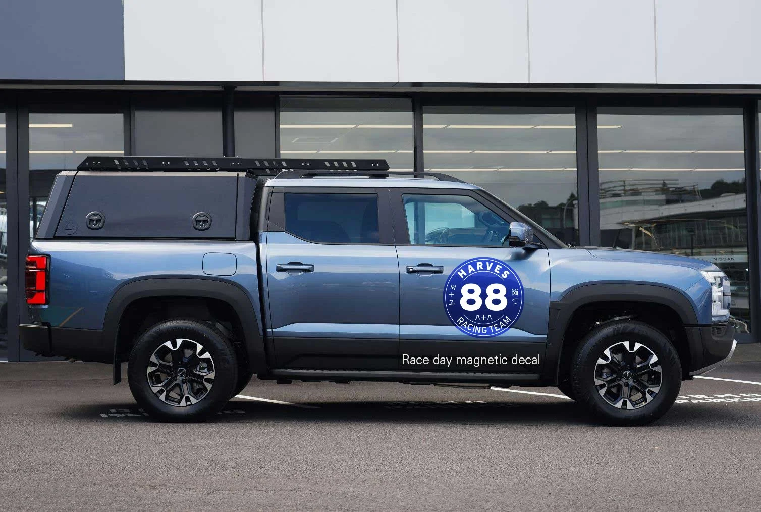
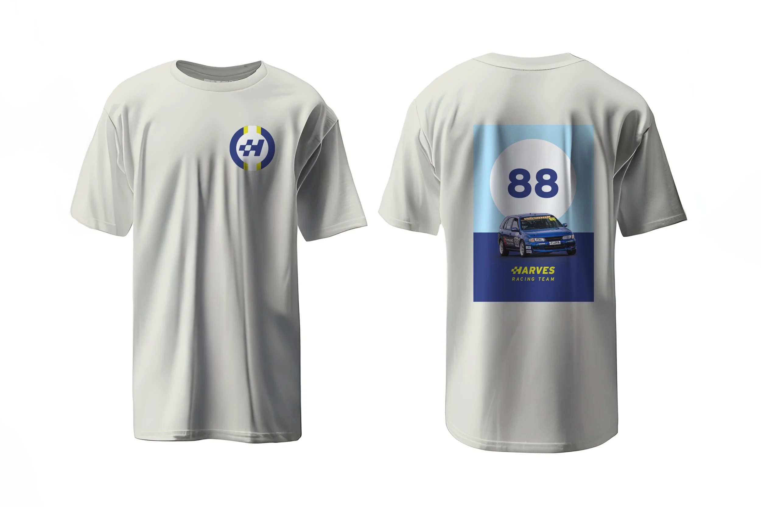
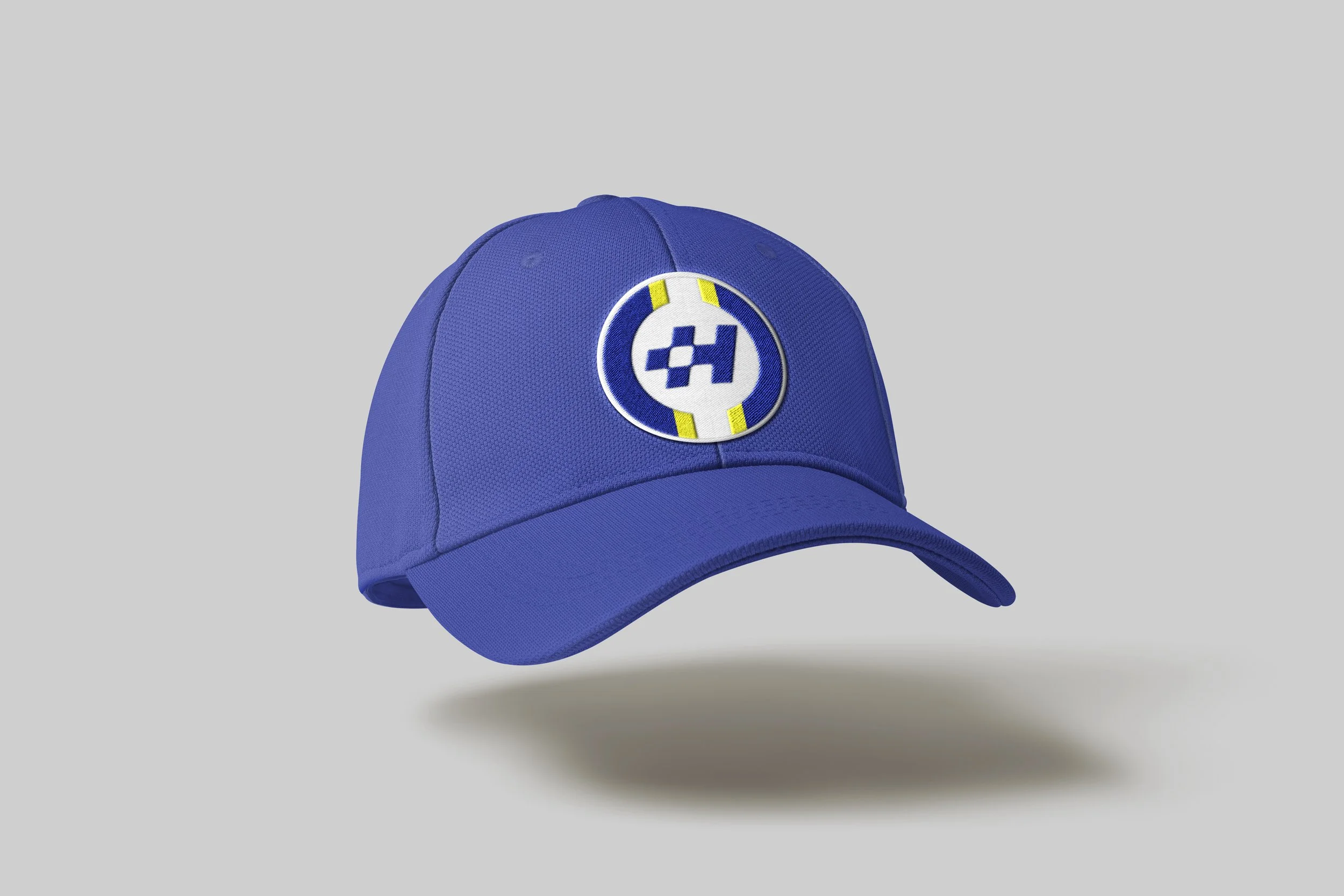
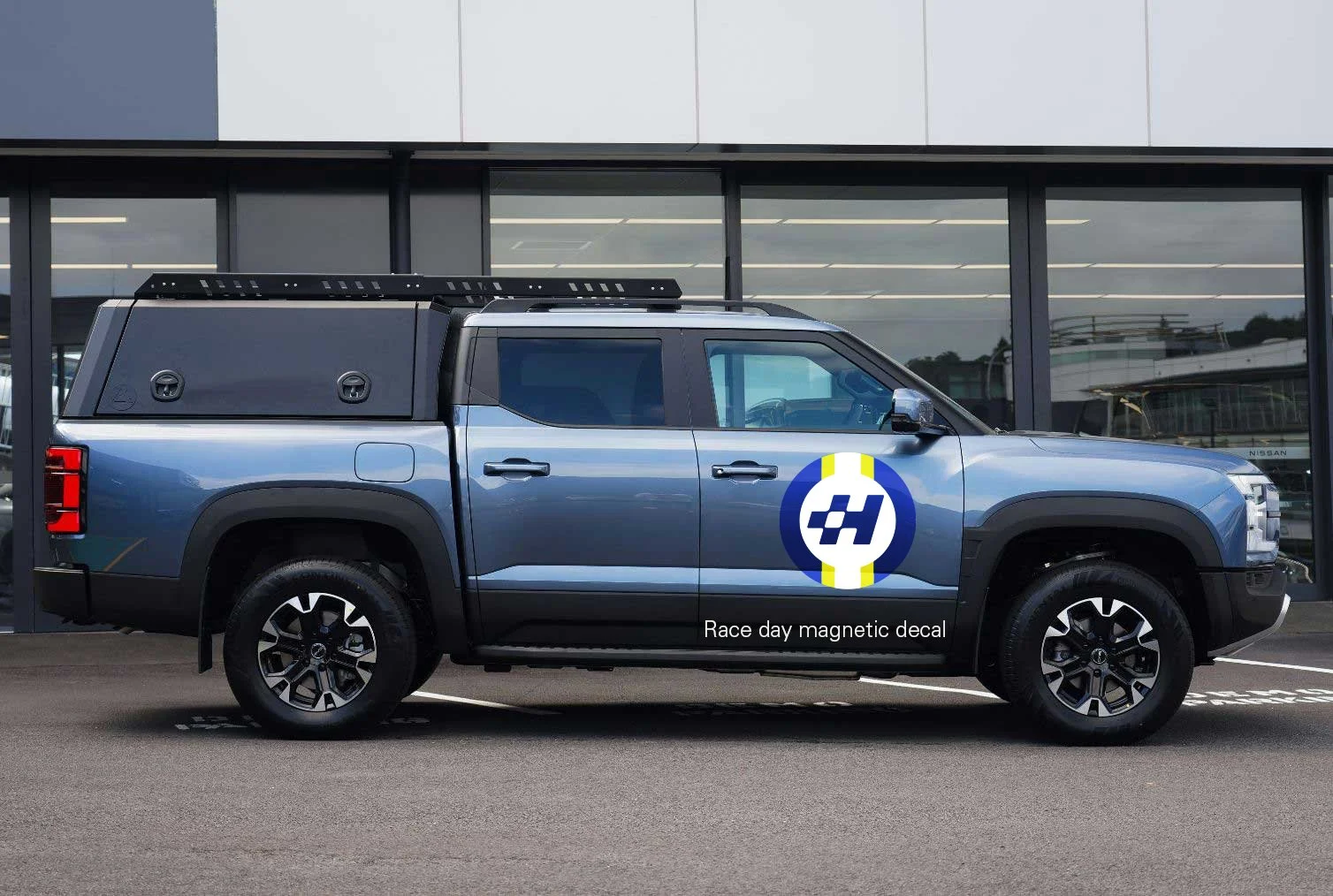
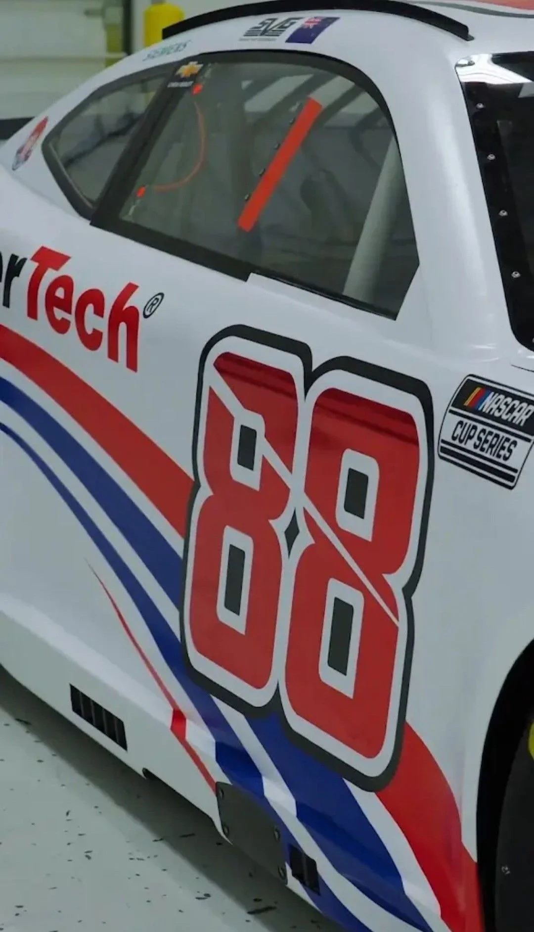
HARVES 88
Explore three distinct creative directions for developing the logo and brand system for Harves 88. The first direction should draw from Japanese retro aesthetics—think bold minimalism, vintage motorsport iconography, and energetic yet disciplined forms. The second direction should capture the elegance and heritage of classic Italian racing, emphasizing refined typography, flowing lines, and timeless sophistication. The third direction should embody a brash American style, leaning into loud colors, muscular shapes, and unapologetically bold visual energy. Each direction should feel unique while remaining adaptable across digital, print, and on-vehicle applications.
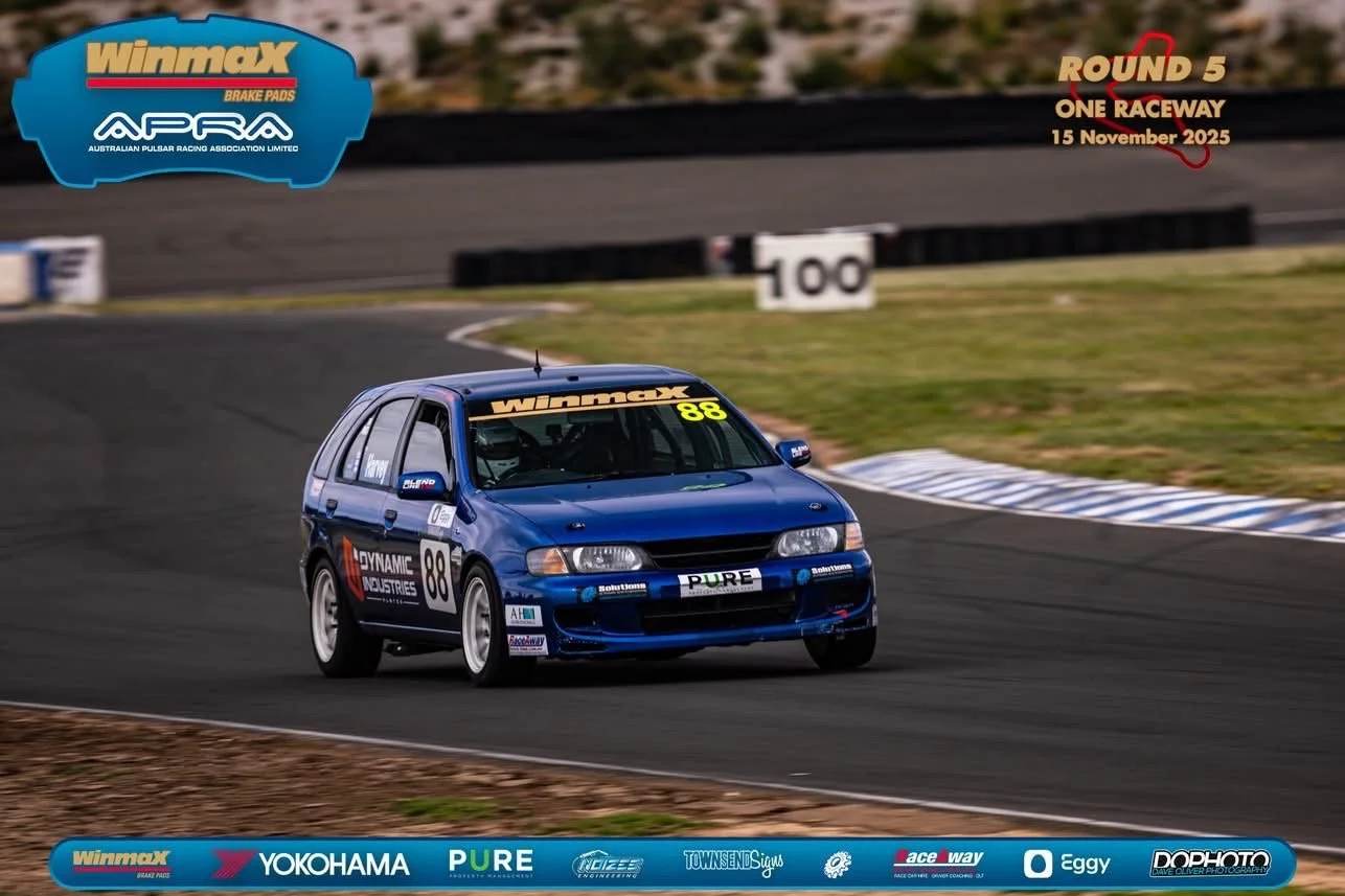
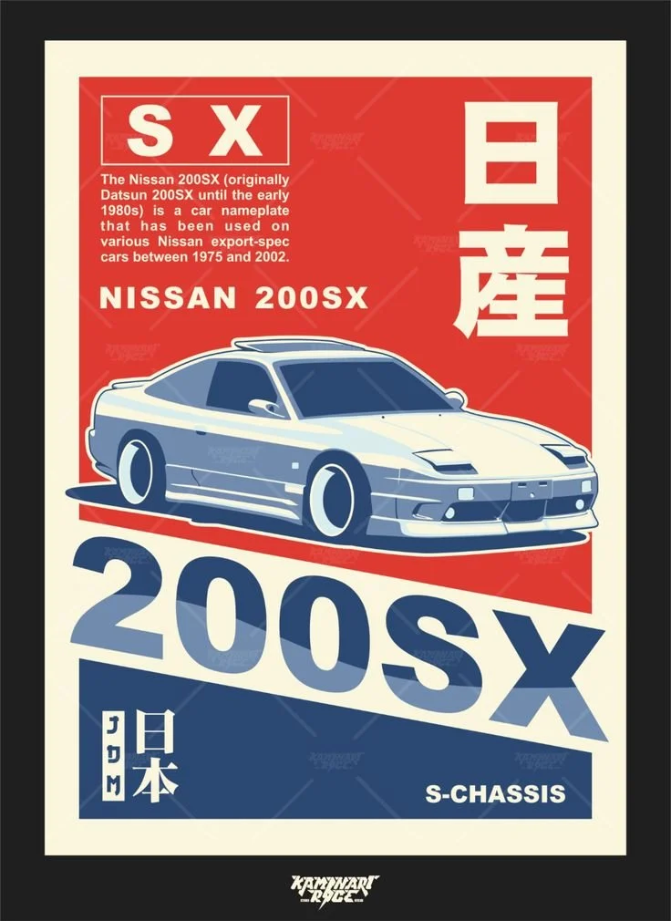
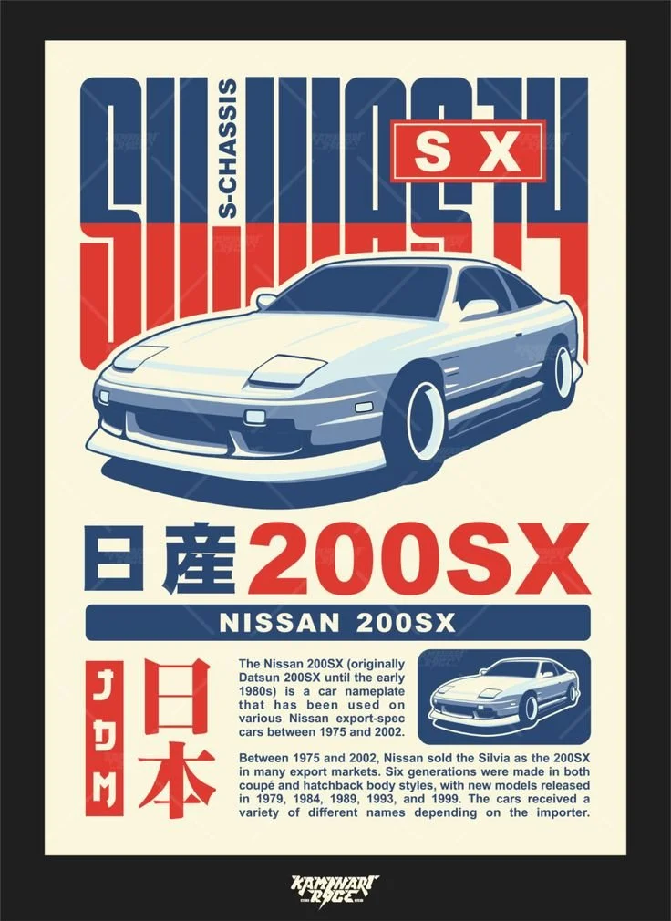
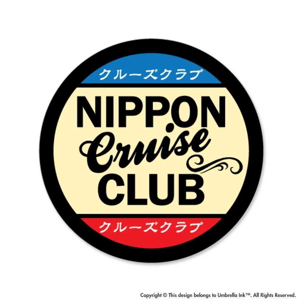
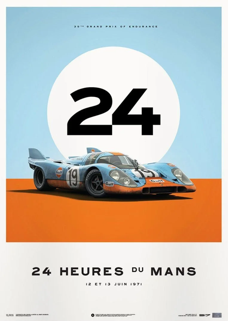
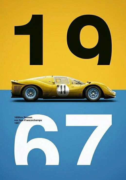
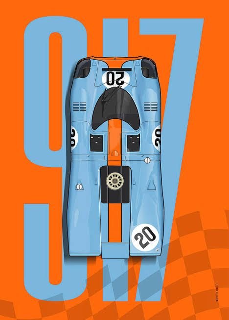
Japanese Retro
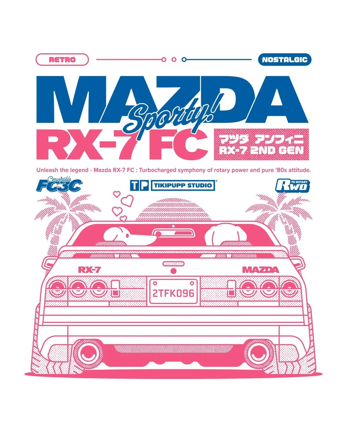
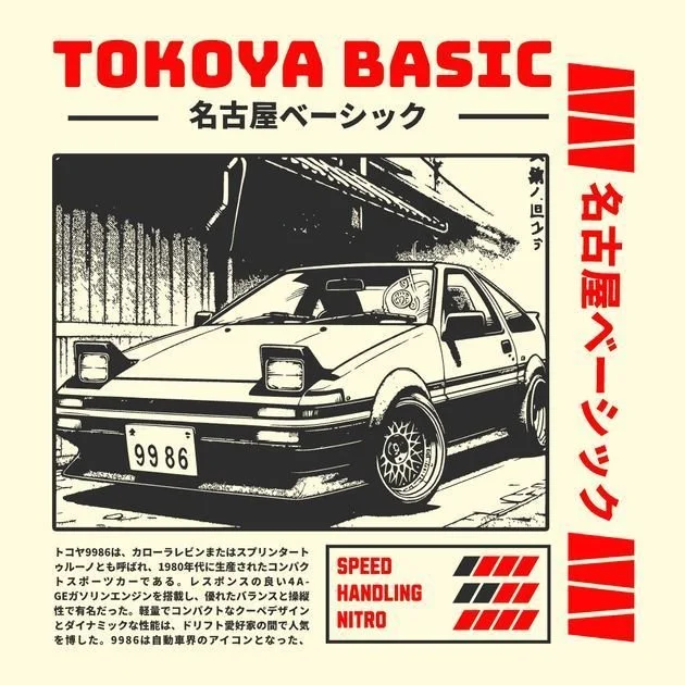
INSPO
CONCEPTS


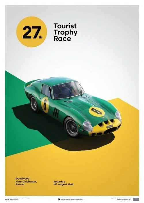
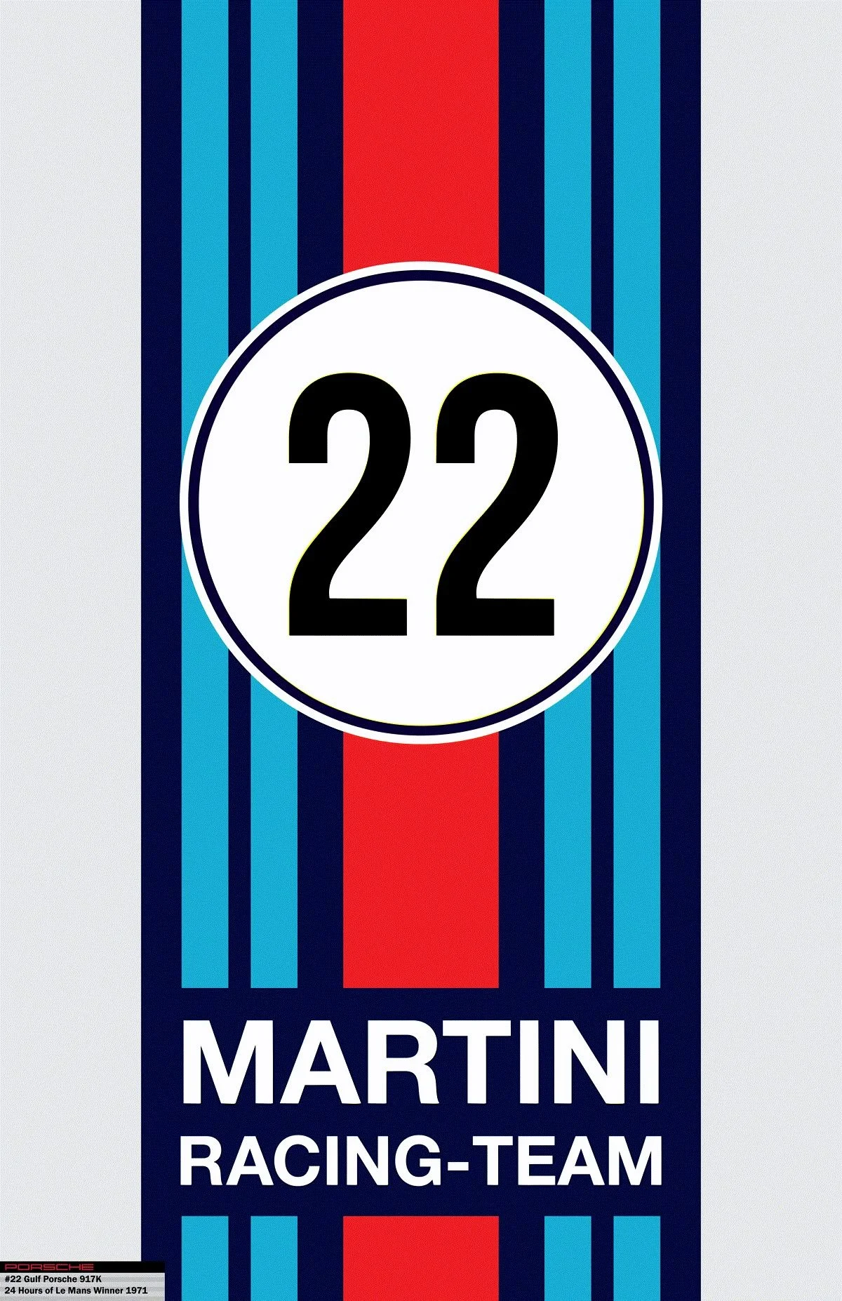
Italian Classic
INSPO
INSPO

CONCEPTS


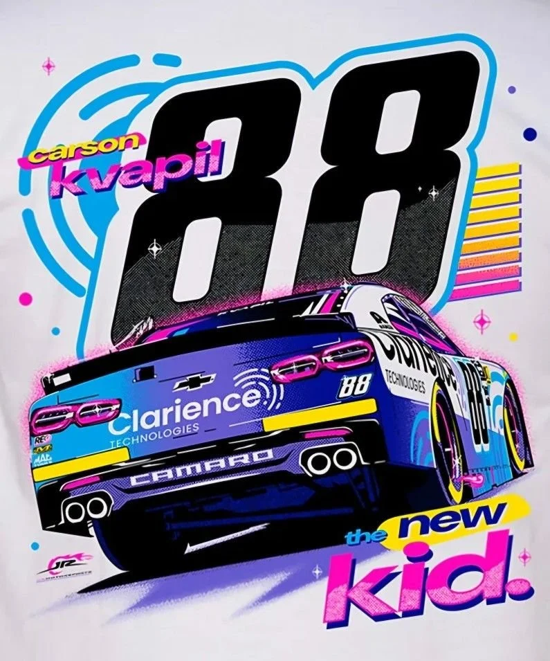
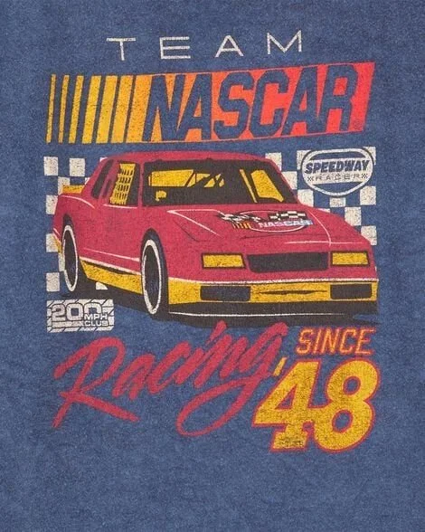
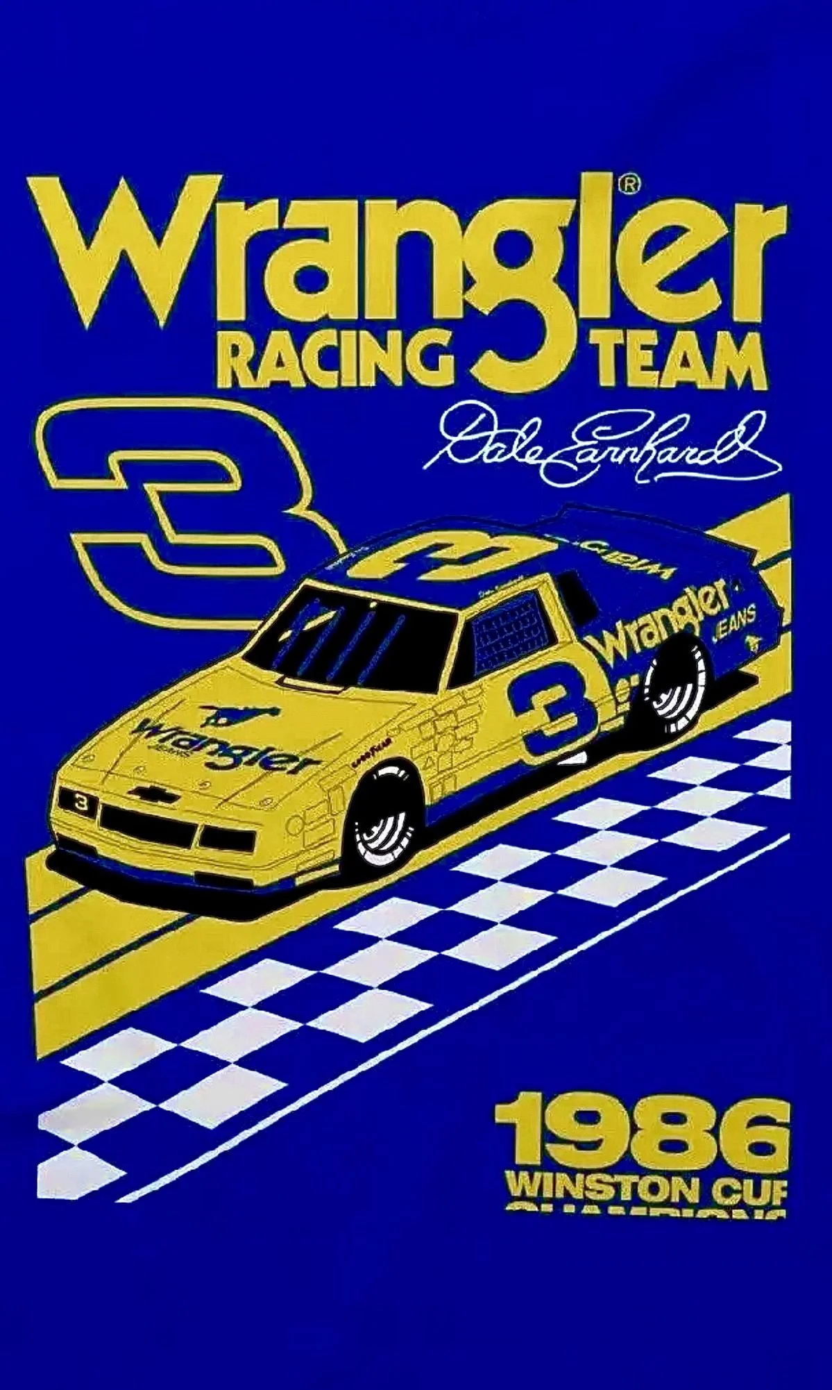
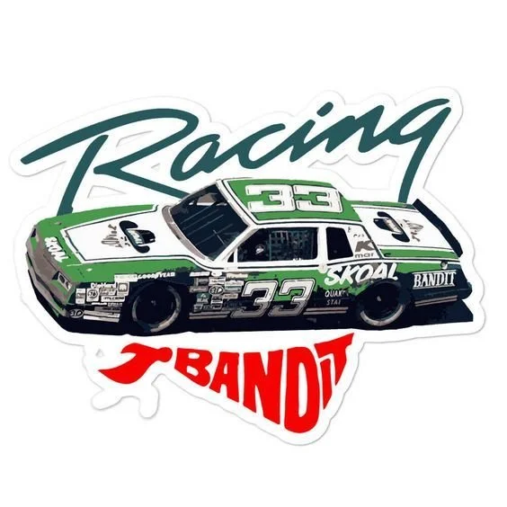
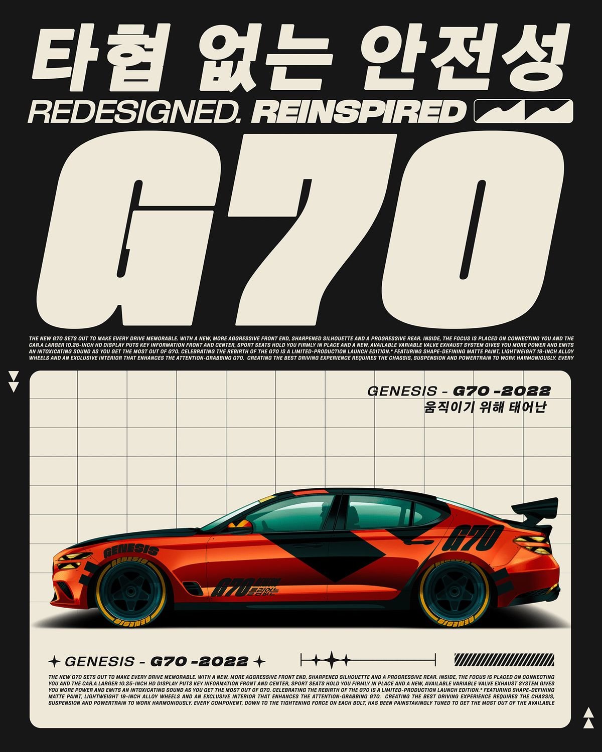
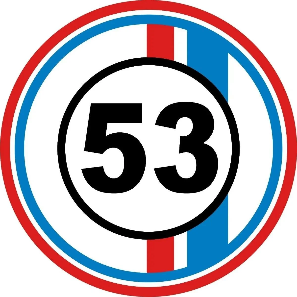
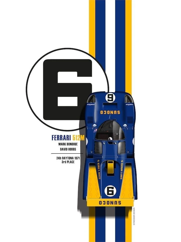
MERICA F YEAH
INSPO
INSPO